Art deco Motifs:
 |
| source |
 |
| source |
 |
| source |
 |
| http://matouenpeluche.typepad.com/.a/6a00e554e97d5c8834011570700fed970b-800wi |
 | |
| source |
 |
| source |
I decided on a font called Ritzy for the headings and Quicksand for the body. I would use circles in Art deco colours for decoration and the same purple background I used on the cards. Using the Ritzy font as a guide I took to Illustrator and created a new colourful font for titles:

The layout and what to include was also hard. I could fit more with A4 horizontal presentation- design it like a flip book with binding on the longest edge. I looked for inspiration online for layout. Smashing magazine had a number of great layouts but it was mainly for web.

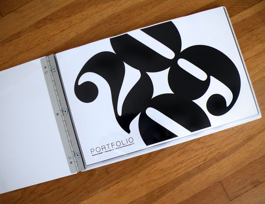
I really liked the landscape layout and the fact that there is a brief explaination and big bright pictures. I will work with this as a guide.
For what to include I looked at what other fashion students were including:


Instead of including lots of bits-and-pieces outfits i would rather show an employer my design process using one garment range. This will better showcase my skills and where my ideas came from. I also want to include my styling, illustration and feature articles.
No comments:
Post a Comment