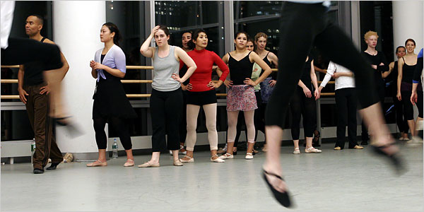
for the last few weeks i've been trying to come up with a way of proving a little added protection to neck and ears that the ballerinas can wear while practicing. Hoods are prefect but not practical when moving about. About the only headwear sports people actually wear (apart from helmets) are swimming caps......
I thought by lengthening the sides for ear coverage and building up a few layers of fabric (for both fahionability and UV protection) it would provide a little bit more protection and still be practical. Here's a starting point...
I use the pattern of a swimming cap then create long ties that overlap at the back and wrap around the head.
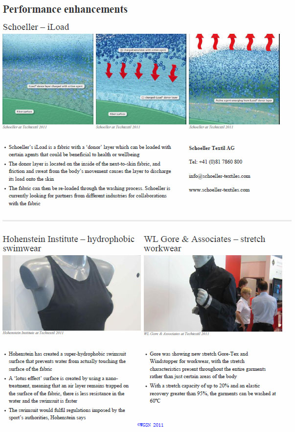
When i was hunting for fabrics i went on WGSN to have a look for fabric ideas, they had a whole report on new smart textiles and thermo-regulatory fabrics were a key area of research. While none of these fabrics are availible and/or in my price range i thpught it was interesting to see into the future....
Sections taken from report by Andrew Jobling and Sophie Mather, WGSN report: '2011: Techtextil', June 2, 2011.
I was concerned that perhaps my print was too bright for ballet wear.... known for blacks, dusty pinks and greys, i thought perhaps the cancerous melanocytes were one step too far....
then i remebered looking at the images in the paper of the images of the ballet russes costumes. there was a recent exhibition in NGA Canberra. some of the costumes, designed by the artist of the day, were examples of the large shapes and bright colours that modernism championed. honestly they make my designs look tame....
These are the images of Freja Beha Erichsen by Craig McDean in Tough Ballerina | Interview April 2010. I loved this editorial shoot and it was part of the reason i wanted to do Ballet wear.....
Adult Ballet Classes are on the rise.... not just for ex-dancers, these classes cater to a wide variety of age groups and abilities. Ballet, like most classical arts, tends to be frequented more by those of a high socio-economic class and so these women expect quality high end garments to wear to class.
With my range, I am targetting the same women who would wear Stella McCartney for Adidas to play tennis or golf in. They want to appear stylish and fashion forward even when (not quite) working up a sweat.
The designs need to be equally understated as they are fashion forward. I think my idea of using matt and meshed fabrics will work well and i have to be careful not to over use the print.
The two campaigns I remember were the slip-slop-slap campaign and a teen orientated "sun tattoo" campaign.
I think this ad campaign worked because it was friendly, easy to remember and didn't keep reminding you that you were going to die a cruel and horrible death. I find that because so many advertiser go straight for fear mongering tactics we get overwhelmed with all the things that are going to kill us and we switch off. This is fun, laughter and sunshine with a message - perfectly appropriate for the audience and the topic of conversation.
This second ad worked for me for a completely different reason.....
While it looks like a fairly basic ad nowadays, when it first came out it got peoples attention due to the fact it used then 'new' CG animation techniques which i thought were great. This made me remember the ad and therefore, i also took home the message.
From these ads i guess I want my clothes to be fun, friendly and easy to wear but also new and innovative- those things are what will make people wear them and therefore, be saving their skin as well....